
Knowledge about colors is handy if you are in the art business, fashion, and web design. Colors usage affects several elements, including buying habits and consumption altitudes. It, therefore, is essential to understand colors and how they relate to each other.
Choosing colors can be challenging when you have little knowledge of the subject. Therefore, this article will give you a complete guide on complementary colors and teach you how to use the color wheel that aids in selecting appropriate hues for the work at hand.
Table of Contents
- 1 Complementary Colors-Ultimate Guide
- 2 What are Complementary Colors?
- 3 Examples of Complementary Colors
- 4 Introduction to Color Psychology
- 5 What is Color Theory?
- 6 Complementary Colors Generator/Color Wheel
- 7 What Happens When You Mix Complementary Colors?
- 8 Complementary Colors in Painting
- 9 What are the 6 Pairs of Complementary Colors?
- 10 What are the 12 Split Complementary Colors?
- 11 What are 10 Complementary Colors?
- 12 Examples of Split Complementary Colors
- 13 Bottom line
Complementary Colors-Ultimate Guide
All you need to know about complementary colors is that they are opposite each other on the color wheel. When mixed, they produce a grayscale hue and placing them next to each other leads to the most evident contrast. This guide will elaborate on using a color wheel and give examples of complementary colors you can mix and use in your design, art, or painting.
Related: Edgecomb Gray Complementary Colors Guide
What are Complementary Colors?
Two colors that are opposite one another on the color wheel are said to be complementary. Complementary colors neutralize each other when mixed, leaving a black and white or gray color. Colors complementing one another are sometimes called “opposite colors.”
When used together, complementary hues enhance one another’s vibrancy, but when mixed, they produce a dramatic shadow effect.
Related: Sage Green Complementary Colors Guide
Examples of Complementary Colors
Complementary colors, defined as those on opposing sides of the color wheel, are fundamental to studying color theory. They consist of one primary color and the resulting secondary color when the other two primaries are combined. For example, purple, a combination of blue and red, is a complementary color to yellow.
What are the 6 Complementary Color Combinations?
We may deduce the following three sets of complementary colors from the Red-Yellow-Blue color paradigm. They are directly opposite one another on the color wheel shown above.
- Blue and Orange
- Red and Green
- Yellow and Purple
If you continue around the color wheel, you’ll find that even the tertiary colors (those made up of a primary and a secondary hue) are complementary. Tertiary complementary colors include:
- Red–Orange and Blue–Green (aqua)
- Yellow–Orange and Blue–Purple (Indigo)
- Red–Purple and Yellow–Green
Introduction to Color Psychology
Knowing what color comprises and how it affects web design and people’s actions is crucial before diving into the lovely color palettes you may employ to develop websites. We’ll delve into the science and language of color theory, so you can better navigate the color wheel and appreciate its nuanced distinctions.
Different colors have different effects on people. It is why no one will paint a nursery black or a bright red medicine cabinet. That also applies to works of art. When you pick the appropriate colors, you can improve your outcomes. Let’s discuss the meanings of a few specific hues:
- Red – Brings to mind feelings of urgency, power, enthusiasm, energy, and confidence; it draws a lot of focus and gets people moving and alert when on banners.
- Yellow – Yellow can make you both anxious and frustrated, despite its positive connotations; Websites with this design feature may be difficult to read; Use yellow for alerts, banners, and footers.=
- Orange – evokes a range of emotions typically associated with red and yellow. It’s bright and cheery like yellow but also has the eye-catching power of red and is friendly. Appropriate for use in navigation bars, toolbars, and call-to-action buttons.
- Blue is for business websites’ headers, footers, and navigation bars because of its association with reliability and dependability.
- Green – Green is for websites dealing with topics like nature, psychology, health, and charity because of its relaxing impact on visitors. Green boosts reading abilities, and some studies suggest that it also leads to creative bursts.
- White is one of the essential colors in design because it provides a blank canvas to layer additional color without distracting the overall design.
- Pink – Creates enticing backgrounds perfect for sites aimed at women because of the color’s association with love, safety, and femininity.
- Purple – Because of its connotations of royalty, mystery, and riches, the color purple is responsible for high-end goods and services.=
- Black – represents all that is dark, daring, and mysterious;
While black is the primary color for body text and in conjunction with white to achieve a minimalist aesthetic, it is not recommendable for use in large parts of the design.
What is Color Theory?
How do painters and designers choose the right colors to use?
They rely on the science of color. When choosing complementary hues, color theory is crucial to art and science. Isaac Newton came up with the idea for the color wheel in 1666. The color theory relies on the color wheel, which graphically displays the connections between various hues.
Color harmony is a combination of colors that looks excellent next to each other. Artists and designers rely on these to realize their visions. Applying the principles of color theory, used to determine complementary color schemes. Finding colors that work well together requires experimenting with numerous color combinations to get the right balance.
Complementary Colors Generator/Color Wheel
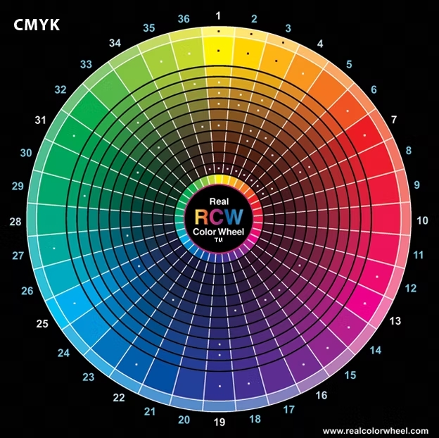
A color wheel can be analogous or complementary. Artists frequently resort to the RYB color wheel, comprising red, yellow, and blue primaries. The red, green, and blue color wheel, abbreviated RGB, is used mainly for digital media. Canva’s color wheel is an RGB color wheel.
Check this excellent interactive Color wheel by Canva.
What Happens When You Mix Complementary Colors?
A muted color is the result of combining two complementary colors. Combining these hues produces a muted, grayish version of the original shades. Adding additional blue to the orange would cause it to lose some of its actual colors.
On the flip side, if you add orange to blue, you dilute the blue’s intensity. All the color pairs that are opposite each other have this property. In a nutshell, the effects of using two complementary shades are canceling each other.
Complementary Colors in Painting
Also, contrasting complementary hues in a painting are visually appealing and intellectually stimulating. It’s because every possible permutation produces results that are unique from the others.
The Vermeer picture shows that complementary hues may make a painting more vibrant and eye-catching. Take note of how the proximity of the blue and orange in the picture draws attention to that region.
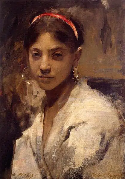
It’s not necessary to place color palettes directly next to each other for them to create a powerful effect in a painting. Check out the Sargent painting titled “Head of a Capri Girl.”
The girl’s black hair stands out against the background’s mellow green hue, and red highlights highlight the headband. Despite this, the green background makes the headband’s color stand out more than it usually would because it is the opposite of green.
What are the 6 Pairs of Complementary Colors?
Two opposed hues on the color wheel are said to be complementary. That’s because these hues complement each other so well. Let’s look at the six color combinations that work well in textiles.
- Red + Green.
- Red-orange + Blue-green.
- Orange + Blue.
- Yellow-orange + Blue-purple.
- Yellow + Purple.
- Red-purple + Yellow-green.
What are the 12 Split Complementary Colors?
Split-Complementary color schemes resemble the Complementary color schemes we discussed in many ways. They are created by selecting a single hue from the color wheel and then employing the hues on either side of the complement as their base and accent colors. The following images should help clarify that, at least in my mind. Let’s look at the 12 different fabric color schemes that use divided complementing colors!
- Red, Yellow-green, Blue-green.
- Red-orange, Green, Blue.
- Orange, Blue-green, Blue-purple.
- Yellow-orange, Blue, Purple.
- Yellow, Blue-purple, Red-purple.
- Yellow-green, Purple, Red.
- Green, Red-purple, Red-orange.
- Blue-green, Red, Orange.
- Blue, Red-orange, Yellow-orange
- Red-purple, Yellow, Green
- Purple, Yellow-orange, Yellow-green
- Blue-purple, Orange, Yellow
What are 10 Complementary Colors?
Most people already have a fair variety of colorful clothes. They tend to be hesitant to wear unexpected shades together. If you’re ready to branch out and try some new color combinations, here are ten tried-and-true color schemes that will keep you looking chic and fashionable even when the weather outside is frightful.
- Navy+Orange
- Blush +Burgundy
- Green+Yellow
- Blue+ Pink
- Red+Fuchsia
- Teal+Green+Blue
- Yellow+Grey
- Camel+Black
- Olive+White
- Grey+Grey
Examples of Split Complementary Colors
An example of a split complementary color scheme is one in which a primary color combines with both of the colors adjacent to it on the color wheel (those to the left and right, respectively) rather than just the complementary color.
For instance, Since orange is the opposite hue of blue on the color wheel, yellow and red-orange make up the two colors used in a complementary split. Other examples of split complementary color schemes:
- Red, blue-green, and yellow-green.
- Blue, red-orange, and yellow-orange.
- Yellow, blue-purple, and red-purple.
- Purple, yellow-orange, and yellow-green.
Splits offer aesthetically acceptable differences between colors when you want complimentary hues but don’t want anything as bright. For the best fabric designs, visit Heather Bailey Clamshell Quilt: True Colors Blog Tour + Giveaway!
Bottom line
In terms of using complementary hues, feel free to experiment. Learn how many different shades you can create by blending paints and test swatches. Always remember the rule of using the primary color’s complementary color on the color wheel to get the desired result.
Do you want to construct a striking color combination, set the tone for a painting or design, or draw attention to a specific area? Choose two complementary colors from the color wheel today, mix them, and you will surely be pleased with the outcome.


